


Summary
Our team was tasked with designing a new digital product concept for the Georgia Aquarium within a 2 week sprint. They are currently expanding their habitats and plan on having an entirely new layout by 2020, making this a great time to design a mobile product for visitors to update and improve their experience, overall. We interviewed visitors about their experiences at the aquarium, looked at the current product and competitors’ products, and went to the aquarium ourselves to get a feel for what the current experience is and how it could be improved.
Roles
Created & implemented the interview screener
Conducted 2 interviews & pulled out actionable insights
Sketched with group
Created wireframes
Created the interactive prototype
Conducted usability testing & synthesized the notes into insights for iteration
Organized detailed images, files, & notes into a deliverables report document
Presented our design process & product
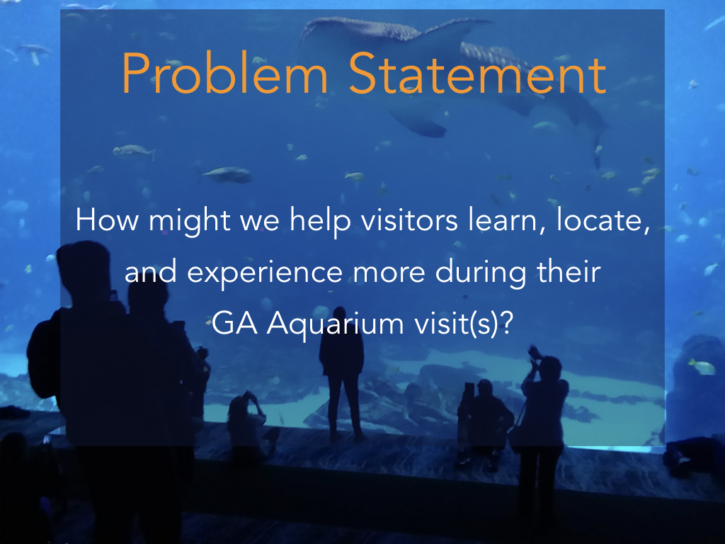
The Problem
The current app offered by the GA Aquarium has a lot of downloads but very poor reviews. Users want and need an app to enhance/enable a visit to the GA Aquarium but the current product is not delivering what the users expect.
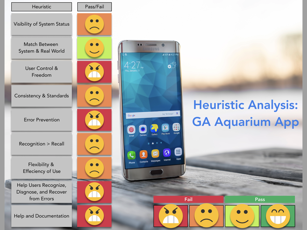
The Current Product


Interviews


Interview Insights
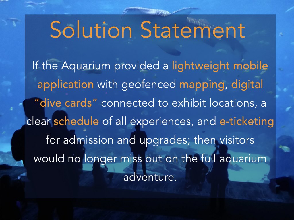
Including the availability for detailed information on species and habitats in the app, we call them virtual “Dive Cards”
Including a “Dive Buddy” in the app who will interact with the user using geo-fencing technology to give information in a fun and instructive way to resemble the availability of a staff member delivering the information
Including multiple languages in the app to cater to the many international guests to the Aquarium
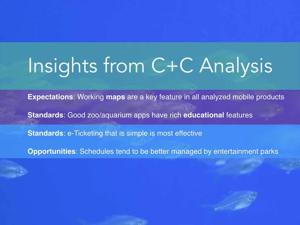
Including a map with the aquarium floor-plan layout so that a map is always available
Having interactive features available on the map- zoom in, zoom out, tap to view quick info on habitats, as well as geolocation showing where the user is within the floor-plan
Creating the app with a fun feel, especially the “Dive Buddy,” but also including the availability to access more detailed information so the experience can also be educational
Including a ticketing feature with the availability to purchase tickets, passes, and extras such as “Encounters”
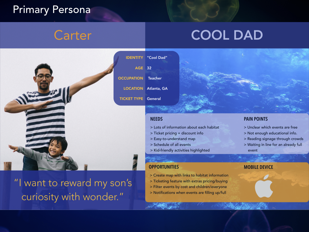
Personas

Solution

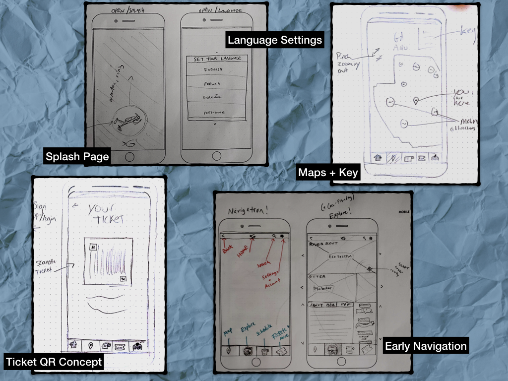

Sketch of Wireflow

User Flow

Annotated Wireframes


Prototype

This is a video of an early on prototype of mobile app concept "Dive Buddy" to enhance the Georgia Aquarium experience. Click above to play video of the prototype.
Prototype Testing Insights
Specific pages and icons are confusing
Discover icon (Dive Buddy)- if he is introduced during on-boarding then he can stay rather than be replaced by more traditional icon for section
Schedule icon- introduce function in on-boarding or replace
Compass for map- some users may struggle understanding function, introduce in on-boarding
Header too small
Some type too small- ex, Dive Card bottom w/ schedule
Many got confused with Buy Tickets at top of ticket page
Audio icon should be headphones not microphone
On-boarding- Login/Signup process should be simplified
Change "Don't Miss" wording for schedule section
Consider changing "Explore" box in home page
Penguin popup- if leads to Dive Card, needs to prompt user that there is more info if click
Need to use caution with Map page to make sure user intuitively knows it is interactive if doesn't directly state it is interactive
More clear instructions with Wi-Fi/GPS
When purchasing, give option for quantity
Confirmation page after checkout
Mood Board

Mockups

As we began mockups, we also considered the low-light setting that this app would be used in. Bright colors and white backgrounds would be disruptive and uncomfortable when viewed by aquarium light, so we maintained a darker theme throughout all elements. Color would typically be used for calls to action, and images of the habitats and events would be used to enrich lists wherever possible.
Here you can see some of the authentication, initial language, and GPS settings - which are all taken care of before the home screen or accessible in settings later.
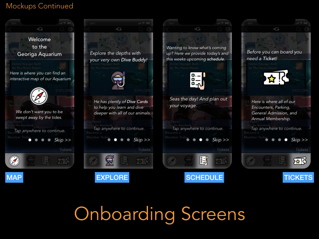
The on-boarding sequence suggested by our testers takes place as soon as you reach the homescreen, using an overlay to highlight/de-emphasize parts of the screen for a miniature tour. This can also be skipped.

Instead of wasting space with a hero image, our home page provides windows into each of the main features - which can still be toggled between using the bottom icons, for more detail.
The Map takes the top spot on the home page. Our mockup shows the current artist map of the aquarium’s interior, but we would look forward to collaboration on a new map design following the expansion in 2020.
Explore, just under map, will default to displaying the ecosystem you are closest to if GPS is enabled - otherwise it will slide between all ecosystems.
Under Explore you have the Schedule. You can see a schedule of upcoming Encounters a little more closely in the middle image - this is what Carter sees when checking for the Penguin events.
After tapping Penguin Encounter, he can immediately see the price, details, map location, and buying options.
Next Steps
More usability testing with the mocked up prototype
A second design sprint for Android UI
Coordination with artists and Marketing at the Aquarium for the 2020 expansion
And assisting with recruitment of a local developer team to launch the app
Project by: Jonathan Gaspard, Michael McFarlane, Kai Simmons, & Jules Wood